Hatteras' Ink & Insight
Fun Facts of the Printing World
Discover fascinating tidbits and quirky truths about the printing industry. From bizarre printing mishaps to historic milestones.
Subscribe to our newsletter
Don't miss out on the hottest trends, latest tips, fun facts, and insights from Hatteras in our monthly newsletter.
SUBSCRIBEWho Should We Send Our Newsletter To?
DID YOU KNOW...
The Wright Brothers Were Also Printers
Before achieving fame for powering flight, Orville and Wilbur Wright ran a small printing business in Dayton, Ohio, in the late 1880s and early 1890s. In fact, printing was their first successful entrepreneurial venture. Orville developed an early interest in publishing while still a teenager and even designed and built his own small printing press from scrap metal. Together, the brothers launched several publications, including a short-lived newspaper called The West Side News and later The Evening Item.
Their print shop also printed flyers, business cards, and other items for local customers.

This experience taught them mechanical skills that later translated directly into their bicycle repair business and, eventually, into their work in aeronautics. Many historians point out that the brothers’ comfort with machinery began in the print shop long before they wanted to make an airplane.
So while the world primarily remembers them for the first successful powered flight in 1903, their background in printing is real and is often cited as an early example of their inventive mindset.
Hatteras Ink & Insight
More Printing Fun Facts You Want to Know
Classic Ghost Signs Date Way Back to the Late 1800s and Early 1900s
These faded, hand-painted advertisements are like hidden time capsules quietly preserved on the sides of old brick buildings, often noticeable if you slow down and look. Ghost signs date back to the late 1800s and early 1900s, when companies hired skilled sign painters to promote everything from tobacco and tonics to shoes, soap, and local businesses.
Instead of vinyl or large-format printing, artists climbed scaffolding with brushes and durable, oil-based paint, creating bold lettering that would withstand years of sun, wind, and snow.
Over decades, as businesses closed, buildings changed ownership, or neighborhoods evolved, the original signage was never fully removed. The result is a soft, almost watercolor-like imprint of history that “haunts” urban landscapes. Today, historians, photographers, and designers actively seek them out because each one tells a story about history and typography trends. Next time you’re in an older downtown area, glance up above storefronts or along alleys. You might spot a century-old advertisement still quietly delivering a message across generations.
February is One of the Strongest Months of the Year for Books, Especially Romance Titles
Valentine’s Day and printed books have more in common than you might think.
Romance is consistently one of the most popular and highest-earning fiction genres in publishing, generating over $1 billion in annual sales in the U.S. alone. Industry reports regularly show romance at or near the top of fiction sales rankings, with especially strong performance during the first quarter of the year. February often sees a noticeable boost as readers purchase romance novels not only as gifts, but also for themselves.
Bookstores lean into this seasonal love for reading every February. Romance tables, poetry collections, and creative promotions like “blind date with a book” consistently rank among the most successful in-store displays. Even older romance titles often see renewed interest during Valentine’s season.
Romance novels also have remarkable staying power. Older romance titles published years or even decades ago frequently resurface and experience sales spikes thanks to word-of-mouth, social media trends like BookTok, and seasonal promotions around Valentine’s Day. Some publishers report that older romance titles account for a significant share of overall romance sales, demonstrating that these stories continue to find new audiences long after their original release.
For bookstores and publishers alike, romance remains a reliable and growing category, especially in February, when readers are actively seeking stories centered on connection.
Over 12 Billion Pieces of Mail are Delivered Between Thanksgiving and New Year's Day
Every year between Thanksgiving and New Year’s Day, the U.S. Postal Service delivers more than 12 billion pieces of mail. That staggering volume includes greeting cards, letters, catalogs, and millions of carefully wrapped packages making their way across the country.
To handle the holiday surge, the Postal Service hires tens of thousands of seasonal workers and operates extended hours at many facilities. Sorting centers process mail around the clock, moving nearly 400 million items each day. Conveyors, scanning systems, and trucks run nonstop so that everything from small-town letters to cross-country packages arrive in time for the holidays.
The tradition of exchanging mail during the holiday season dates back to the mid-1800s, when printed Christmas cards first became popular. Since then, the act of sending a physical message has remained a cherished tradition, one that relies on an enormous national network working at full capacity for nearly six weeks straight.
Red and Green Became the Staple Colors of Christmas... But Why?
Ever wonder why red and green define Christmas?
Every December, the colors red and green are everywhere: on cards, wrapping paper, signage, and storefront displays. But have you ever wondered why those two colors became the unmistakable symbols of Christmas?
The story begins long before Christmas itself. Ancient Celtic and Roman cultures celebrated winter festivals such as Yule and Saturnalia by decorating with evergreens like holly, ivy, and mistletoe. These plants stayed vibrant even in the coldest months. The green leaves and red berries of holly became a natural symbol of warmth during the darkest days of winter.
December 25 is the celebration of Jesus’ birth; those familiar colors took on new meaning. Green came to represent eternal life, reflecting both the evergreen’s endurance and faith’s promise of renewal. Red came to symbolize the blood of Christ, a reminder of love and sacrifice.
Centuries later, red and green received a modern boost through the power of print. In the 1930s, Coca-Cola’s famous holiday ads featuring Santa Claus in his red suit surrounded by green backdrops helped cement the Christmas color palette we know and celebrate today.
The Shape of the Stop Sign Was Chosen in 1923
The unique octagon shape was chosen back in 1923 so that drivers could recognize it instantly, even from behind or when visibility was low.
When traffic signs were standardized, each shape was designed to signal a different level of importance:
- Round signs were used for railroad crossings — the highest caution.
- Diamond signs indicated warnings, such as curves or deer crossings.
- Rectangles were informational, used for speed limits and directions.
- The octagon was reserved for “STOP” because it would stand out — instantly recognizable, even from behind.
Visibility From Every Angle: The eight-sided design makes the sign easy to identify from multiple viewpoints. Even if the front is obscured by snow, dirt, or darkness, drivers approaching from another direction can recognize the unique silhouette and know a stop is required.
A Design That Transcends Language: The U.S. adopted the octagon for stop signs in 1923, and it’s now used in most countries worldwide as a universal symbol.
Safety in Simplicity: The shape and red color work together to trigger an automatic association with danger, caution, and alertness.
Are There Actually Books Bound in Human Skin?
Deep in Harvard’s Houghton Library sits a book with a story straight out of a horror movie. For years, whispers claimed that three of Harvard’s rare volumes were bound not in leather… but in human skin.
This eerie practice, known as anthropodermic bibliopegy, was rare but real in the 1600s–1800s. Medical books were sometimes bound in the skin of cadavers, a grim attempt to “connect” subject and material.
The most infamous case at Harvard involves a 19th-century French book titled Des destinées de l'âme ("On the Destiny of the Soul"), housed in the Houghton Library at Harvard.
For decades, it was rumored to be covered in human skin. Scientific testing in 2014 confirmed that the binding is, indeed, human skin. According to the text inside the book, the skin was taken from the body of a female psychiatric patient who died of natural causes. The act was supposedly done with respect, though modern ethics would find it profoundly disturbing.
Today, Harvard keeps these artifacts under careful watch, acknowledging their unsettling history. For most of us, the thought alone is enough to send shivers down our spine… proof that sometimes the scariest stories are the ones that are true.
Who is the Most Famous Mail Carrier?
Did you know several famous figures once walked a mail route? It’s true, many well-known names got their start delivering letters and packages. It’s hard to pick just one standout, so here’s a quick look at some of the most notable former mail carriers.
Abraham Lincoln – Before he was president, he was a small-town postmaster.
Benjamin Franklin – The original Postmaster General played a pivotal role in shaping the entire U.S. postal system.
William Faulkner – The Nobel Prize winner, was once fired from his post office job for reading on the clock.
Bing Crosby - The legendary singer worked as a substitute and regular postal clerk in Spokane, Washington, back in 1921
Walt Disney - In 1918, at age 16, Walt worked at the Chicago Post Office as a substitute mail carrier and mail sorter.
Steve Carell - Worked as a rural mail carrier in Littleton, Massachusetts in 1985, during his early years before becoming famous. He’s described it as “the hardest job I ever had.”
Morgan Freeman - Was a real-life mail carrier, specifically a substitute letter carrier in San Francisco, circa 1965.
It just goes to show that you never know where your path may lead you.
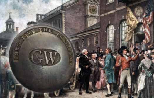
The Concept of Promotional Products Surfaced in 1789
Promotional products actually date back to the founding of our country? It’s true! The first known promotional products in America were created all the way back in 1789, when George Washington was President of the United States. Back then, supporters of Washington wanted to show their pride and rally others, so they crafted commemorative buttons featuring slogans and images that celebrated his election. These buttons weren’t just decorative; they were a way for people to publicly display their support, similar to how we wear team jerseys, campaign pins, or branded T-shirts today.
These simple metal buttons kicked off an entire industry of custom items designed to spread messages, build loyalty, and unite groups. Here at Hatteras, we continue this long-standing tradition by helping people create custom items that promote their brands, celebrate milestones, or simply bring people together. Whether it’s a screen-printed hoodie, an embroidered hat, or a direct mail piece, these products do more than just carry a logo, they tell a story, build connections, and create memorable experiences.
So the next time you pick up a branded pen or put on a T-shirt with a company’s name on it, remember: you’re part of a tradition that stretches all the way back to America’s earliest days.
If you ever want to explore how promotional products can help your business stand out, boost customer loyalty, or add some fun to your marketing, we’re always here to bring your ideas to life.
Does “Rocky” Wear the World's Most Famous Sweatshirt?
It might be. First worn by Sylvester Stallone in the original Rocky film in 1976, the plain gray sweatshirt became an instant symbol of grit, determination, and underdog spirit. In the iconic training scene, Rocky Balboa jogs through the streets of Philadelphia and famously sprints up the steps of the Philadelphia Museum of Art, hood up, sweat flying, eyes locked. That scene is pop culture history, and so is the hoodie.
Since then, the gray hoodie has become a symbol of perseverance for athletes and everyday people who wear it as a sign of pushing through challenges. It’s been remade, referenced, and reimagined by brands. While many hoodies have become trendy over the years, few carry the emotional weight and universal recognition of the Rocky hoodie.
Deltiology is the Third-Largest Collectible Hobby in the World
Mark Twain's The Adventures of Tom Sawyer was the first novel ever written on a typewriter. Before typewriters, authors wrote everything by hand. They used pens dipped in ink and wrote on paper, which could be slow and messy. Mistakes had to be crossed out or the page rewritten entirely. Some writers hired assistants, called copyists or scribes, to rewrite their manuscripts neatly for publishers. Using a typewriter made the process faster and more efficient. Pages could be typed quickly and were easier to read and edit.
Although early typewriters did not have many features, like lowercase letters or correction tools, it was a significant step forward. Mark Twain’s use of the typewriter helped pave the way for a new era of writing, where authors could work faster and keep better drafts. The Adventures of Tom Sawyer became a literary classic and marked a turning point in how books were created. Mark Twain’s progressive approach helped shape the future of writing. His influence extended beyond storytelling as he helped change how stories were written.
Deltiology is the Third-Largest Collectible Hobby in the World
Deltiology might sound like something you'd study in a laboratory, but it’s one of the world’s largest hobbies. Derived from the Greek word “deltos,” meaning “writing tablet,” deltiology is the study and collection of postcards.
Deltiology is the third-largest collectible hobby in the world, after coins and stamps. The term deltiology was coined in the 1940s, but the passion for collecting postcards goes back to the late 19th century. The earliest recognized postcards were sent in the 1860s. The years 1900-1920 are called the “Golden Age of Postcards”. During this time, it was common for people to send postcards as frequently as we send text messages today. In fact, between 1907 and 1915, the U.S. Postal Service processed nearly a billion postcards each year.
Deltiology is appealing because it mixes history, geography, design, and human connection. Each postcard is a tiny time capsule. Deltiologists often collect by theme, such as holidays, cities, transportation, or famous events. Believe it or not, some postcards are incredibly valuable. Rare cards from the early 1900s or those with misprints, unusual subjects, or historical significance can sell for hundreds or even thousands of dollars.
The Supreme Court Protects Your Right to Display a Lawn Sign on Your Property
In 2015, in the landmark case Reed v. Town of Gilbert from Gilbert, Arizona, the Court ruled that sign restrictions based solely on the content of the message were unconstitutional. The Court found that the sign code violated the First Amendment’s protection of free speech by discriminating against certain types of messages.
The ruling in Reed v. Town of Gilbert has significant implications for local governments and their ability to regulate signs. This means that government regulations must be content-neutral, treating all forms of expression equally under the law. When using lawn signs to share a personal opinion, a local cause, or promote your business, your voice is protected.
The Bible is the Top Selling Book of All Time
The Bible is the world’s best-selling book, with estimates suggesting over 5 billion copies have been distributed globally. Its massive sales are not confined to one country or language—it's been translated into over 3,000 languages, making it accessible to people from diverse cultures and backgrounds.
This level of distribution is unmatched by any other book in history. The Bible’s popularity is partly due to its deep cultural, religious, and historical influence. For centuries, it has been the spiritual guide for billions of Christians and Jews, but it also has had a significant impact on art, literature, law, and moral philosophy. Many Western legal systems are built upon principles derived from biblical teachings.
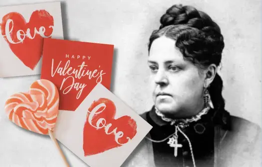
Valentine’s Day Cards Have Been a Cherished Tradition Since the 1840s
The first mass production of Valentine’s Day cards began in the 1840s. An American entrepreneur, Esther Howland, is known to be the “Mother of the American Valentine.”
Inspired by the intricate and elegant designs of European Valentine’s cards, Howland made her own with lace, ribbons, and colorful pictures. Recognizing the immense business potential, she embarked on a groundbreaking venture, producing these cards in large quantities. Through her New England Valentine Company, she established one of the first commercial Valentine’s card businesses in the United States.
Her remarkable success not only popularized Valentine’s Day as a major card-giving occasion but also laid the foundation for future giants like Hallmark to further expand and enrich this cherished tradition in the early 20th century.
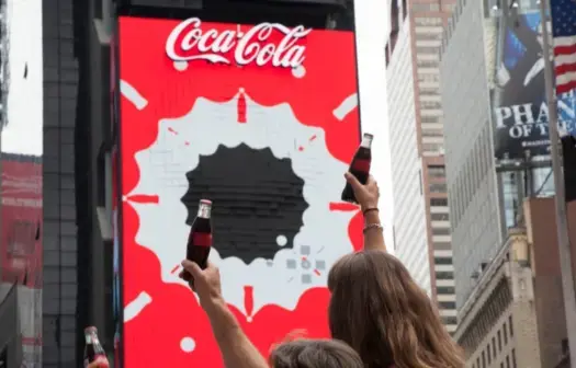
Coca-Cola Displayed the World's First and Largest 3D Robotic Billboard
In August 2017, Coca-Cola unveiled a groundbreaking advertising display in New York City's Times Square: the world's first and largest 3D robotic billboard. The sign, 68 feet tall and 42 feet wide, earned two Guinness World Records titles: "The Largest 3D Robotic Billboard" and "The First 3D Robotic Billboard."
Designed and manufactured by a company named Yaham, the billboard comprises 1,760 independently moving LED cubes. Each cube is programmed to move synchronously with the displayed content. There are an estimated 300,000 daily visitors in Times Square.
The development of this six-story billboard took over four years. The goal was to create a "pause-and-refresh moment" in Times Square. Coca-Cola has displayed signs in Times Square since 1920. The original sign debuted at 49th Street and Broadway. Neon lighting was added in 1923.
Over 2 Billion T-shirts Are Sold Worldwide Every Year
Over 2 billion T-shirts are sold worldwide every year, highlighting their universal appeal and versatility. This massive demand spans all demographics, making T-shirts one of the most popular clothing items globally. From casual everyday wear to promotional merchandise, T-shirts serve multiple purposes in fashion, business, and self-expression. They are a blank canvas for creativity, allowing individuals to showcase their personality, beliefs, and affiliations through various designs, colors, and prints.
Brands, organizations, and events rely on them for affordable, customizable marketing tools, while consumers appreciate their comfort, affordability, and ease of styling. T-shirts can be easily personalized with logos, slogans, or artwork, making them an effective medium for spreading messages and building brand identity.
Fast fashion, online retail, and low-cost manufacturing have contributed to this surge, making t-shirts one of the most produced and consumed garments worldwide.
The Concept of the Envelope Dates Back Thousands of Years
The envelope, as we know it today, evolved from ancient practices of wrapping documents in materials for protection and confidentiality. The concept dates back thousands of years, with early versions used by ancient civilizations like the Babylonians, who would encase clay tablets in outer layers of clay, serving as a "seal" to safeguard the information inside. The clay would have to be broken upon delivery to access the contents.
During this era, the average citizen couldn’t read or write, so it was only the rich who used envelopes to keep communications from prying eyes. It would also have been obvious if anyone had tampered with the letter, as the envelope would have been cracked. In the 2nd century BC, the Chinese developed paper, which led to the use of folded paper to conceal letters. However, it wasn’t until the mid-19th century that envelopes became a common part of communication, especially with the rise of the postal system. Two archaeologists, Jacques de Morgan, and Roland de Mecquenem, found examples of early clay envelopes during separate archaeological digs in the Middle East in 1901 and again in 1907.
Approximately 158,464,880 Unique Books are in the World
This is a challenging question to answer. The ISBN database boasts a list of over 34 million unique ISBNs, which are used to classify books—but that would not be the correct answer. (ISBN stands for International Standard Book Number)
Experts think Google had the best estimate. In 2010, Google tried to count how many books were worldwide, counting 129,864,880. Beginning with the invention of the printing press in 1440, Google gathered data from ISBNs, libraries, and other sources to reach its number. However, the company did not count journals, individual essays, serials, etc. Some believe Google’s number may include duplicates.
So, how many books are in the world as of 2023? UNESCO estimates that 2.2 million books are published every year. The United Nations Educational, Scientific and Cultural Organization, better known as UNESCO, is a leading source for information regarding publishing statistics.
The organization estimates that 2.2 million new titles are published annually, so if we add that number to Google’s count, we can surmise that there are roughly 158,464,880 unique books worldwide as of 2023.
Source: ISBNDB.com
Politicians Had to Spread Their Agenda Via Word of Mouth
Did you know that before the Renaissance, politicians had to spread their agenda via word of mouth? The printing press aided in the spread of political agendas and made election season continue with ease.
Printed propaganda became a powerful tool for politicians to spread their ideas, promote their campaigns, and influence public opinion. Pamphlets, books, and posters could now be mass-produced and distributed widely, reaching broader audiences than ever before. This democratization of information allowed political figures to engage directly with citizens and shape public discourse on a larger scale.
The printing press facilitated the rapid spread of new political ideas and debates, contributing to the intellectual and cultural ferment of the Renaissance period. It empowered politicians to communicate more effectively and harness public support through printed propaganda, marking a significant shift in political communication strategies.
What are the Five Most Overused Fonts for Advertising?
|
Comic Sans is an overused font that appears childish and unprofessional. It is commonly misused, and many believe it should be strictly for youth advertising. |
|
Arial is commonly used within school settings specifically so that the font is not distracting. However, this font is bland and does not draw any attention to the advertising work being done. |
|
Times New Roman is Microsoft's default font and, therefore, is inherently overused. In advertising, there are so many other fonts that are beneficial; however, any default font should not be an option. |
|
Helvetica is a font that big brands have taken advantage of. It has become overused and unoriginal because of how many companies now use it. If used for advertising, it would make brands blend into the bigger companies, therefore leaving them unnoticed. |
|
Courier New should not be used in advertising due to its association with typewritten text, which can give a dated impression to modern audiences. Instead, opt for fonts that convey contemporary style and enhance readability for effective marketing communication. |
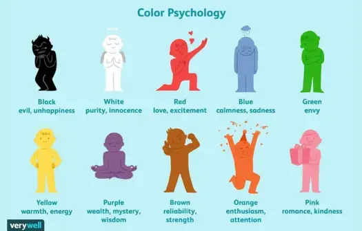
Color Psychology is Considered a Controversial Method of Persuasion
Color psychology in marketing is considered a controversial method of persuasion. This stems from the ethical debate surrounding the manipulation of consumer emotions and behavior through color, yet, it's a common strategy we see from companies all around us.
Did you know that the color red can subconsciously increase your heart rate? It's one of the fascinating quirks of color psychology in marketing. Red is often associated with urgency and excitement, triggering a sense of immediacy in consumers. That's why you'll often find it used in clearance sales or promotional offers, encouraging shoppers to hurry and act quickly.
But it's not just red that wields psychological power in marketing. Blue, on the other hand, is known for its calming effect. Brands like Facebook and PayPal utilize blue in their logos to evoke a sense of trust and reliability. Yellow is another intriguing color. It's often associated with positivity and energy, making it an ideal choice for brands aiming to convey a sense of happiness or optimism.
Think of brands like McDonald's, whose iconic golden arches instantly evoke feelings of joy and warmth. Color psychology plays a significant role in shaping consumer perceptions and behavior.
Whether it's evoking a sense of urgency, building trust, or radiating positivity, the colors chosen by marketers can have a profound impact on how we perceive and interact with brands.
What Does the Japanese Term "Tsundoku" Mean?
Tsundoku is a Japanese term that refers to the act of acquiring books but letting them pile up in one's home without reading them. The word originated in the late 19th century. It combines two words: "tsunde" (to stack things) and "oku" (to leave for a while). Essentially, it describes the habit of collecting books but not actually reading any of them. This results in a growing stack of unread books. The term is often used to humorously describe someone who is an avid book collector but struggles to find the time to read all the books they acquire.
There are some benefits of practicing Tsundoku. It can be a way to support your local bookstore or library. It can also be a way to show your interest in a particular topic or author. Statistician Nassim Nicholas Taleb believes surrounding ourselves with unread books enriches our lives and reminds us of all we don't know.
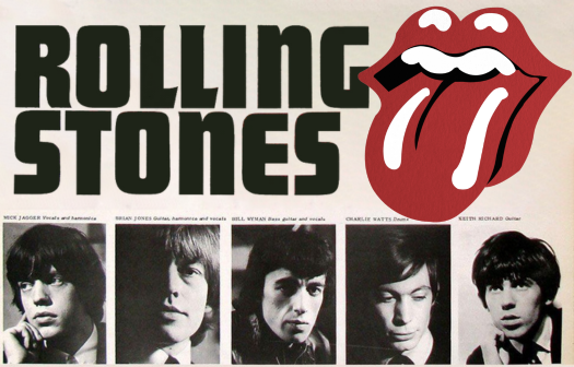
The Famous Rolling Stones Logo Was Designed in 1970
The famous Rolling Stones tongue and lips logo was designed by John Pasche, a British graphic designer. Pasche created the iconic logo in 1970 while studying at the Royal College of Art in London. The design has become one of music and popular culture's most recognizable and enduring symbols.
The story behind the inspiration for the design reportedly came from Mick Jagger's large lips and the rebellious attitude of the Rolling Stones. Another theory is that Pasche was inspired by a medieval painting of the Hindu goddess Kali. The logo has been featured on numerous albums, merchandise, and promotional materials, solidifying its place as one of history's most iconic and enduring band logos.
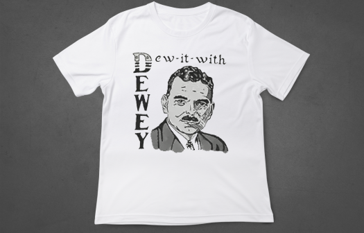
“Dew-it-with-Dewey” – Was the First Political T-shirt
It is believed that the first t-shirt used as a marketing promotional tool is often attributed to the 1948 US presidential campaign. Thomas E Dewey ran for president as the Republican candidate against incumbent Harry S Truman. The Dewey campaign distributed t-shirts featuring a simple slogan: “Dew it for Dewey.”
These promotional T-shirts were a fun and effective way to engage supporters and spread the campaign message. The idea caught on, and since then, t-shirts have increasingly become a popular and widespread medium for promoting various causes, events, and brands.
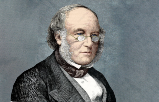
The First Adhesive Postage Stamp Was Invented by Sir Roland Hill
The first adhesive postage stamp, known as the Penny Black, was invented by Sir Rowland Hill. Sir Rowland Hill was a British educator who proposed the concept of prepaid postage and introduced the adhesive stamp.
The Penny Black was issued in the United Kingdom on May 1, 1840. It featured a profile of Queen Victoria and was printed in black ink on a small piece of paper. Sir Rowland Hill's idea of prepaid postage and the introduction of the adhesive stamp revolutionized the postal system, making it more accessible, efficient, and affordable.
The success of the Penny Black laid the foundation for modern postal services worldwide.
The "I❤️NY" T-Shirt is The World's Most Famous T-Shirt
The "I ❤️ NY" t-shirt is arguably the most recognized t-shirt in the world. The history of the shirt is tied to a larger marketing and branding campaign for the city. The logo was created in 1977 by Milton Glaser. The marketing campaign was started to promote tourism in New York.
At the time, New York City was facing economic challenges, and there was a need to revitalize the city's image. It is said that Glaser created the "I ❤️ NY" logo on a scrap of paper during a taxi ride. The campaign was an immediate success and helped contribute to the city's resurgence. The "I ❤️ NY" t-shirt has become a fashion statement and cultural phenomenon.
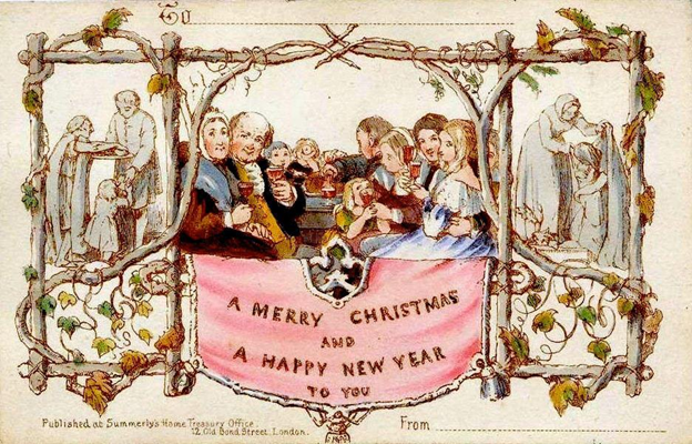
The Christmas Card Was Invented in 1843
Sir Henry Cole was a busy English socialite who struggled to respond to all the written correspondence sent by his many friends. Sir Cole had an ingenious idea. He asked his friend, J.C. Horsely, who was an artist, to draw an idea Cole had sketched out.
Cole took that drawing - a picture of a family sitting at a table celebrating a holiday - and had one thousand copies printed by a local printer. The image was printed on thicker paper and was around 5 ⅛ x 3 ¼ in size. At the top was printed: “A Merry Christmas and A Happy New Year To You”.
The World's Smallest Printed Book Fits on the Width of a Human Hair!
In 2007, Canadian author Charlotte Elizabeth printed the world's smallest book, which measures 0.07x0.10mm. Small enough to fit on the width of a human hair!
The book's name is ”Teeny Ted from Turnip Town.” The book’s content consists of 30 micro-pages containing text and illustrations that require a microscope to be legible.
Due to the minuscule size of “Teeny Ted from Turnip Town,” it is often considered a marvel in micro-printing and has earned a place in the Guinness World Records as the world’s smallest printed book.
The image above reads, "Teeny Ted from Turnip Town a success story by Malcolm Douglas Chaplin BA"
The First Post Office in America Was Established Almost 400 Years Ago!
Did you know that the first post office in the United States was established on July 26th, 1639? The first post office was located in Boston, Massachusetts, and was placed near the waterfront. This was a purposeful location due to sending and receiving mail from ships and other modes of transportation.
The first postmaster was Richard Fairbanks. As postmaster, he was responsible for overseeing the operations of the post office, which was mainly handling incoming and outgoing mail. The invention of the post office provided a central location for collecting and distributing mail. The early post office not only facilitated communication but also played a role in disseminating newspapers, promoting trade, and fostering connections between different regions. Overall, the first post office contributed to the growth of commerce and the exchange of ideas.
The Highest Print Run In History
J.K. Rowling set the world record for the highest print run of any book when she published Harry Potter and the Deathly Hallows.
The first order of printing was a whopping 12 million copies! Scholastic used three printers and multiple bindery houses to produce the books. No other book publication has come close to that size of an order.
The Hollywood Sign is the Most Famous and Recognizable Sign
Since 1923, this sign has been looming over the town and celebrating the LA community. This sign was originally built for a real estate advertisement however, now the sign is a cultural icon that represents the entertainment industry and the glamor of Hollywood.
The Hollywood sign symbolizes the American Dream and even has come to represent the hopes and dreams of people all over the world.
Comic Sans is One of the Most Hated Fonts by Designers
Comic Sans has been widely regarded as the most hated font by graphic designers. Although there has been no formal vote or survey conducted by a specific organization. Instead, it has evolved over time through discussions and opinions in the design communities. The font was designed for a playful and casual appearance. However, it is often misused in formal documents and serious communications. This has led to a perception of unprofessionalism.
Comic Sans was created by Vincent Connare, a British typographer and font designer. The font was designed in 1994 while Connare was working at Microsoft. The font was initially intended for use in a specific software called Microsoft Bob, which had a cartoon-like interface.
Helvetica is the Most Popular Font Ever Used
Did you know that the font Helvetica is one of the most popular fonts ever used? Helvetica was named Neue Haas Grotesk and was developed by Swiss typeface designers Max Miedinger and Eduard Hoffmann in 1957. Over the years, the typeface has been updated with different weights, styles, and sizes.
After some reworkings in 1983, this font was modified and known as subset Neue Helvetica. Today the original Helvetica family consists of 34 different font weights. Some of the largest corporations in the world use this extremely popular font. BMW, Target, Jeep, Microsoft, Apple, NASA, and the US Government all use the Helvetica typeface.
National Dog Bite Prevention Week Was April 9-15th 2023
In 2022 the US Postal Service reported that more than 5,300 postal employees had been attacked by dogs nationwide. To highlight this serious issue the US Postal Service has begun a campaign to educate the public using the hashtag: #dogbiteawareness
The US Postal Service also dedicates a week every year to help educate the public on helpful do’s and don’t when it comes to receiving your mail - and to stress the importance of responsible pet ownership. Even friendly dogs instinctively will want to protect their family and home.
Here are some of the helpful Do’s:
- When a letter carrier comes to your house, keep animals inside or behind a fence.
- Keep pets on a leash at all times
- Teach children in your home about how to care for their pets and protect mail carriers
Do Not:
- Do not accept mail from the carrier directly. Dogs can feel this is a threat. Mail should be placed in your mailbox not handed to anyone.
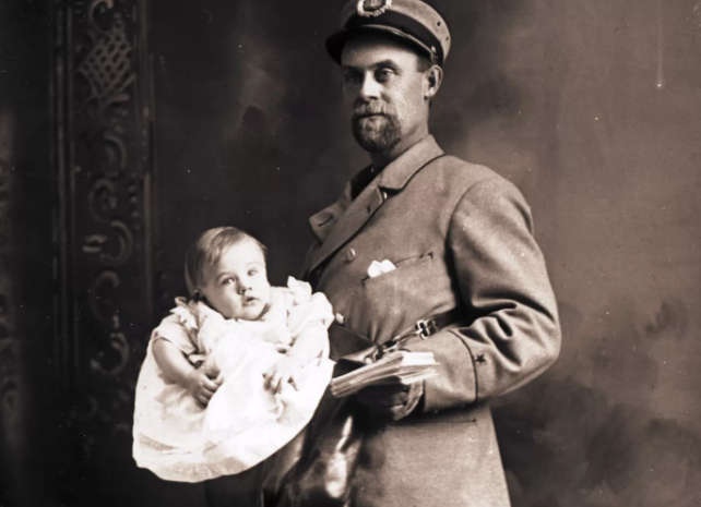
Once Upon a Time, It Was Legal to Mail a Baby in the United States!
Smithsonian curator, Nancy Pope, confirmed and documented in her article “Very Special Deliveries” that several children, including one 14-pound baby, were stamped, mailed, and delivered by the US Post Office between 1914-1915.
According to Pope, there were few postal regulations and they failed to specify what could and could not be mailed via the postal service. In January 1913 an unnamed baby boy in Batavia, Ohio was delivered by postal carrier to his grandmother about one mile away. Pope writes that “The boy’s parents paid 15 cents for the stamps and even insured their son for $50”.
Pope also details that the longest trip taken by a “mailed” child was in 1915 when a six -year old girl traveled from Pensacola, Florida to Christiansburg, Virginia. The 50-pound little girl made the 721-mile trip on the mail train for just 15 cents in postal stamps.
The Post Office officially stopped “baby mail” in 1915 after regulators barred the mailing of human beings. Today the USPS regulations allow the mailings of live animals, including chickens, reptiles, and bees - but no more babies.
The Hulk Wasn't Always Green
Marvel's The Incredible Hulk was not always the recognizable green that we all know and grew up with. The Incredible Hulk was created by super hero extraordinaire Stan Lee. After writing the first issue of his Incredible Hulk comic, Lee took his drawings to be printed. Lee originally envisioned The Hulk to be the color gray. Lee was hoping his character would have mass appeal and didn’t want him to have any one ethnicity. However, the printer struggled to keep the gray consistent on every page.
For the 2nd issue, Lee changed the color of his famous character to green. The printer found it was easier to print in green rather than gray. Lee later said in an interview, "It turned out to be a great choice. By making him green, I was able to give him nicknames like "the jolly green giant" so I'm very glad we made him green."
KISS Teams Up With Marvel Comics
In 1977 at the peak of their popularity, the famous rock band KISS teamed up with Marvel Comics and created a special edition (and at the time very controversial) comic book. The four members of the supergroup KISS traveled with Stan Lee to the Marvel Comics printing facility in Buffalo, New York.
A nurse drew blood from each member of the group (Gene Simmons, Paul Stanely, Peter Criss, and Ace Frehley). The event was even recorded by a notary public to confirm authenticity. Their blood was then mixed with red ink and used to print their special edition comic book ”A Marvel Comic Super Special!: KISS”.
This comic turned out to be a success and sold over 500,000 copies. It was Marvel’s best-selling single issue for several years until the 1990s with the relaunch of Spider-Man.
The Postmaster General is the Next Highest-Paying Federal Government Employee
The postmaster general is the next highest-paying federal government employee after the U.S. President and even makes more than our vice president. The U.S. president Joe Biden, earns a base salary of $400,000 a year.
In June of 2020, Louis DeJoy was appointed as the 75th postmaster general in the United States. His current salary is $305,681.00 - which is surprisingly higher than any other federal government official including our vice president who earns $235,100 per year.
Paper was invented around 100 BC in China.
In 105 AD, a Chinese government official, Ts’ai Lun was the first person to start the paper-making industry. It is thought he made paper by mixing finely chopped mulberry bark and hemp rags with water, mashing it to pulp and laying it flat, and then pressing out the water and letting it dry in the sun.
Previously, people communicated by carving pictures and symbols into tree bark or painted on cave walls or clay tablets. It took almost 300 years for Ts'ai’s “paper” to travel to the region that is now known as the Middle East.
Edible Ink Was a Gourmet Treat
Using a Canon i560 inkjet printer, Chef Humaro Cantu of Moto in Chicago, Illinois, began producing edible sushi in 2005. Chef Cantu prepared some of the most mouthwatering sushi plates for his guests while using edible ink.
Although the restaurant is now closed, at the time people offered to pay up to $240 to sample his unique menu.
Benjamin Franklin Was the First Postmaster General in U.S. History
Benjamin Franklin was the first Postmaster General of the United States. He was appointed in 1775. Prior to this, the American colonies had their own postal systems.
Franklin played a key role in establishing a more organized postal system for the newly formed United States. Franklin established mail delivery routes and setting postal rates.
Printing Presses Became Battlefield Allies During the Civil War!
It's hard to imagine, but soldiers used printing presses on the battlefield during the Civil War. Printing presses played a significant role in passing along information, propaganda, and orders to troops during the war. Printing presses were portable and could be transported among armies.
Presses were operated by soldiers who had some experience or were trained to run the presses. Printed material served multiple purposes, like boosting morale, spreading propaganda, and providing information about military operations. Both Union and Confederate armies recognized the importance of effective communication. The printed newspapers were called "camp newsletters" or "soldiers' newspapers" and helped connect soldiers with the latest news on the war's progress.
Print Messaging is Less Annoying than Internet Messaging
Printing has been found to be 43% less annoying than the internet. Customers are often perturbed by the large number of junk emails, pop-up ads, and unsolicited online promotions that crowd their digital spaces daily.
Surprisingly, traditional print media—be it a well-crafted catalog, a personalized letter, or a thoughtful thank-you note—is often appreciated. Unlike digital messages, which are often dismissed with a swipe or a click, printed materials invite engagement and linger in the recipient's physical world, creating a meaningful and lasting impression.
.png?width=525&height=336&name=Hatteras%20Fun%20Fact%20Images%20(9).png)
Edible Ink Was a Gourmet Treat
Using a Canon i560 inkjet printer, Chef Humaro Cantu of Moto in Chicago, Illinois, began producing edible sushi in 2005. Chef Cantu prepared some of the most mouthwatering sushi plates for his guests while using edible ink.
Although the restaurant is now closed, at the time people offered to pay up to $240 to sample his unique menu.
Enjoying the Fun Facts?
Subscribe to Our Monthly Newsletter to See More Fun Facts of the Printing World
Subscribe Now


.png)
.png)
.png)

.png)

%20(1).webp)

.webp)
.webp)
.webp)
.webp)
.webp)
.webp)
.webp)
.png)
.png)
.png)

.png)

.png)
.png)
.png)
.png)
.png)
.png)
.png)
.png)
.png)
.png)